

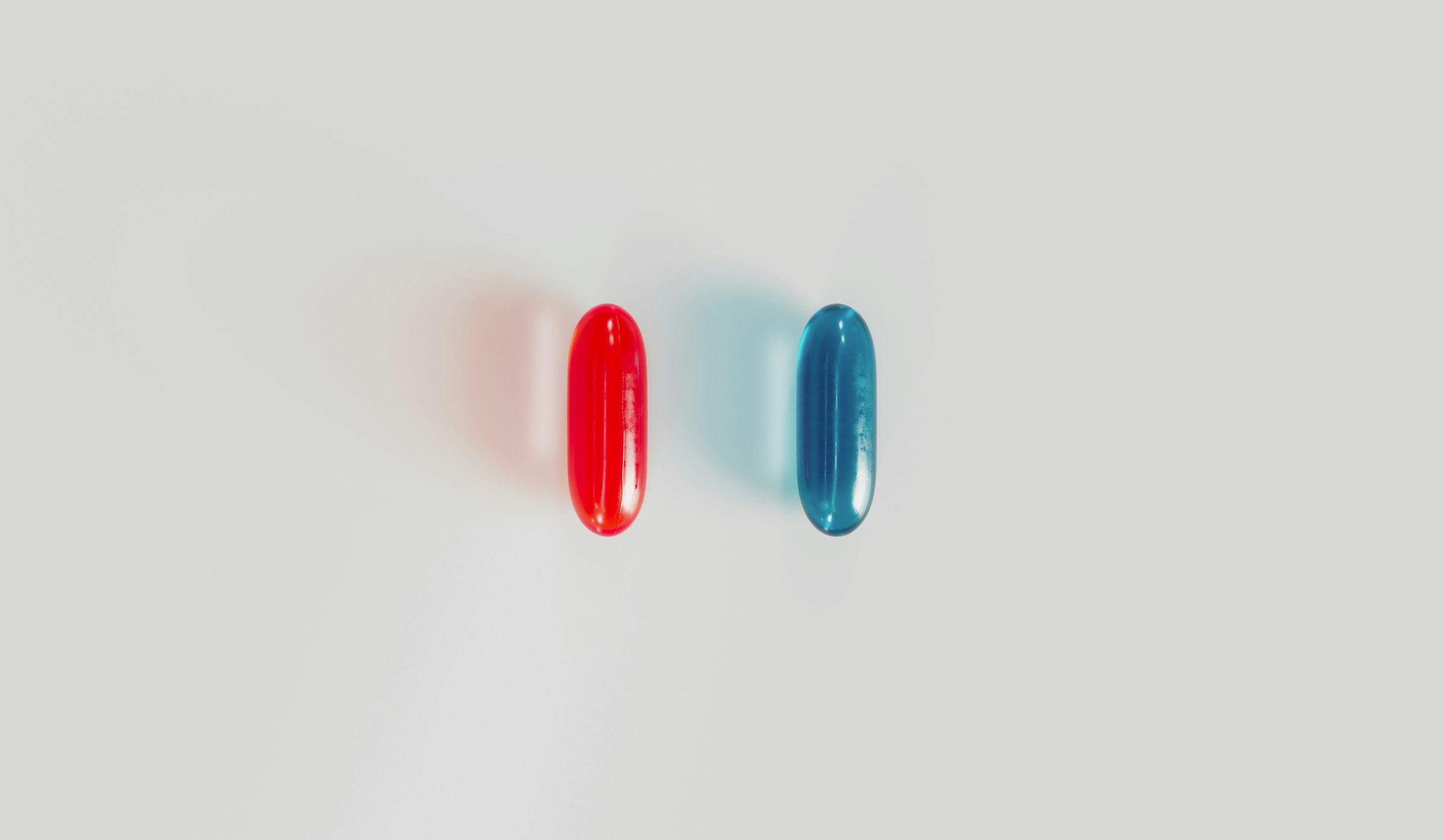
Most sales pages make the same mistake. They show visitors every offer at once, then wonder why nobody picks anything. Too many options, zero urgency, zero creativity.
So here is a strategy you can steal today. It borrows from the most famous choice in movie history: red pill or blue pill. Two offers. One choice. And once they choose, there is no going back.
The Idea in One Sentence
Give visitors two buttons (say, Red Pill: Clearance Sale and Blue Pill: New Product), let them pick one, then lock them into that choice so the other door stays shut.
Click red and you get the clearance deals. Try to sneak over to the new product page afterwards and you get bounced straight back with a message telling you your choice is locked in.
Why It Works
1. It turns browsing into a decision. A normal page asks people to scroll. This one asks them to commit. That small shift changes how seriously they engage with whatever is behind the door they picked.
2. Scarcity without fake countdown timers. Nobody believes the timer that resets every time they reload. A one-time choice feels genuinely scarce, because it is. You only get one choice.
3. Curiosity does the selling. The moment someone can't see the other option, they want to. That itch keeps your brand in their head and gives them a reason to talk about it, share it, or come back with a friend.
4. It's fun. People remember brands that play with them. A sale page that feels like a game gets screenshotted. A sale page that feels like a sale page gets ignored.
5. Free segmentation data. Every click tells you something. Red pill people are deal hunters. Blue pill people want the newest thing. Tag them in your analytics (especially true in Shopify) and you know exactly which message to send each group next.
How to Set It Up
The whole thing runs on one small script and a cookie. No app, no plugin, no developer retainer. Three steps:
Step 1. Add pill-lock.js to every page on your site (sitewide footer code works fine).
Step 2. Give your two buttons a data-pill attribute, set to either red or blue:
Step 3. Change the page paths at the top of the script to match your own site. Here is the full script:
That's it. The choice is saved in a cookie for 30 days. Both buttons disable once a pick is made, any link pointing at the other page is blocked, and anyone who types the other URL directly gets sent back with a green-on-black notice. Change DAYS if you want the lock to last longer or shorter.
Running It on Shopify
Yes, this works on Shopify too, on any plan and with no app. You just put the pieces in slightly different places.
1. Add the script to your theme. In Shopify admin, go to Online Store > Themes > Edit code, add a new file called pill-lock.js in the Assets folder and paste the script in. Then open theme.liquid and add this line just before the closing body tag:
2. Swap in your Shopify URLs. Shopify pages don't end in .html, so point the two paths at a collection and a product instead, for example:
3. Add the buttons. In the theme editor, drop a Custom Liquid section onto your homepage or a landing page and paste in the two button lines from Step 2. Leave out the script tag, because your theme is already loading it.
One Shopify quirk worth knowing. Shopify often shows the same product at a second address, like /collections/new-in/products/your-new-product. The lock matches the exact path, so it won't catch that version. To make it watertight, change the two === otherPage(choice) checks in the script to .endsWith(otherPage(choice)), and any URL ending in your product's address gets caught.
Bonus move: link the red pill to a Shopify discount link (yourstore.com/discount/YOURCODE) so the deal applies automatically at checkout. Give each pill its own discount code and Shopify's discount reports will tell you exactly which pill made you more money.
How to Make It Land
- Make both offers genuinely good. The tension only works if people actually hesitate. If one pill is obviously better, it's not a choice, it's a trick. For this I did 'discounts of up to 90% on the sale, and made sure at least 4 products had 90% discounts (easy for a clearance product).
- Tell people the choice is final before they click. A line like "Choose wisely. You only get one." is half the magic. The lock should feel like part of the game, not a nasty surprise.
- Use it for moments, not forever. Product launches, end-of-season sales, Black Friday, a limited drop. It works best as an event.
- Track which pill wins. Fire an analytics event on each button and you'll learn more about your audience in a weekend than a survey would tell you in a month.
- Follow up differently. Retarget red pill visitors with deals and blue pill visitors with launch content. Same list, two very different conversations.
A Quick Honesty Note
This is a cookie lock, not Fort Knox. Anyone who clears their cookies or switches browsers gets a fresh choice, and that's fine. The point is the moment of commitment, not keeping people out for good. Don't use it to hide pricing or block access to anything a customer genuinely needs, like support, terms or checkout. Keep it playful and it stays on the right side of clever.
The Small Print
Use it at your own risk. The code in this post is shared for free, as-is, with no warranty. Test it on a staging site or a duplicate theme before it goes anywhere near your live store, and check it fits your cookie consent setup and local privacy rules. MTHD can't accept liability for how it's used or for any issues it causes on your site.
Inspired by, not affiliated with. The Matrix and everything in it belongs to Warner Bros. We don't own it, and this post isn't affiliated with or endorsed by Warner Bros. in any way. It's a campaign idea inspired by a famous scene, nothing more. If you run it, make your own assets: no film stills, posters, logos, character names, quotes, fonts or music. Original design and your own copy keep the idea clever and keep you out of trouble.
Want More Ideas Like This?
This is exactly the kind of thinking we bring to every brand we work with: simple ideas, built fast, that make people stop and pay attention. If you want your marketing to feel less like a brochure and more like an experience, click here to book a call to work with our team.