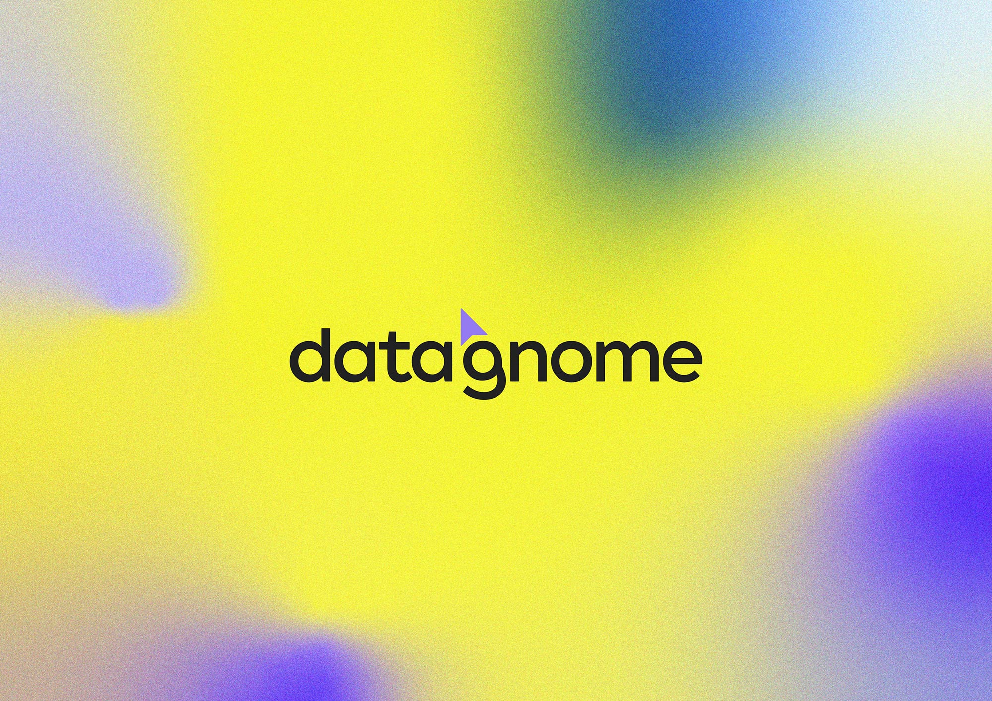
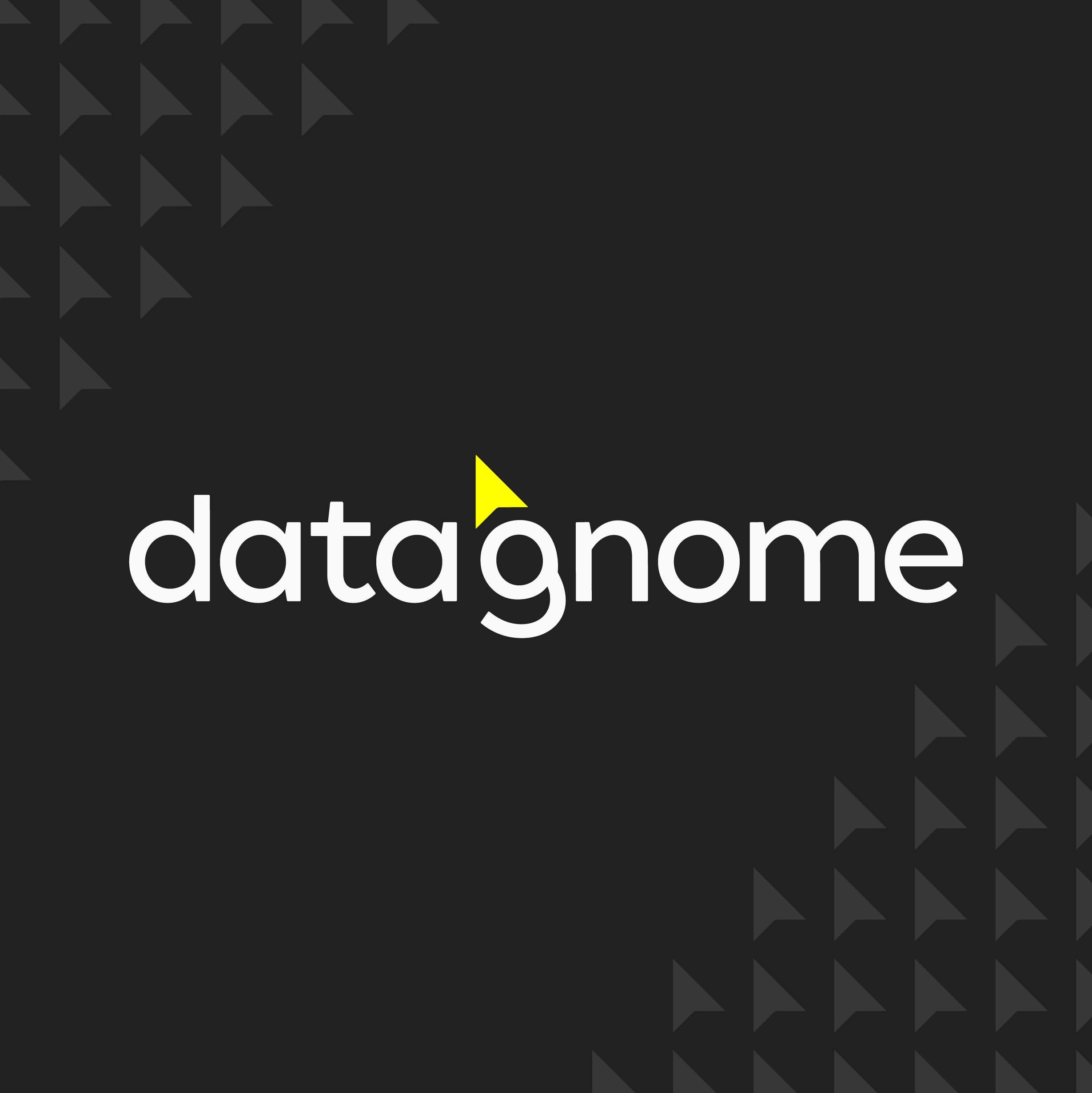
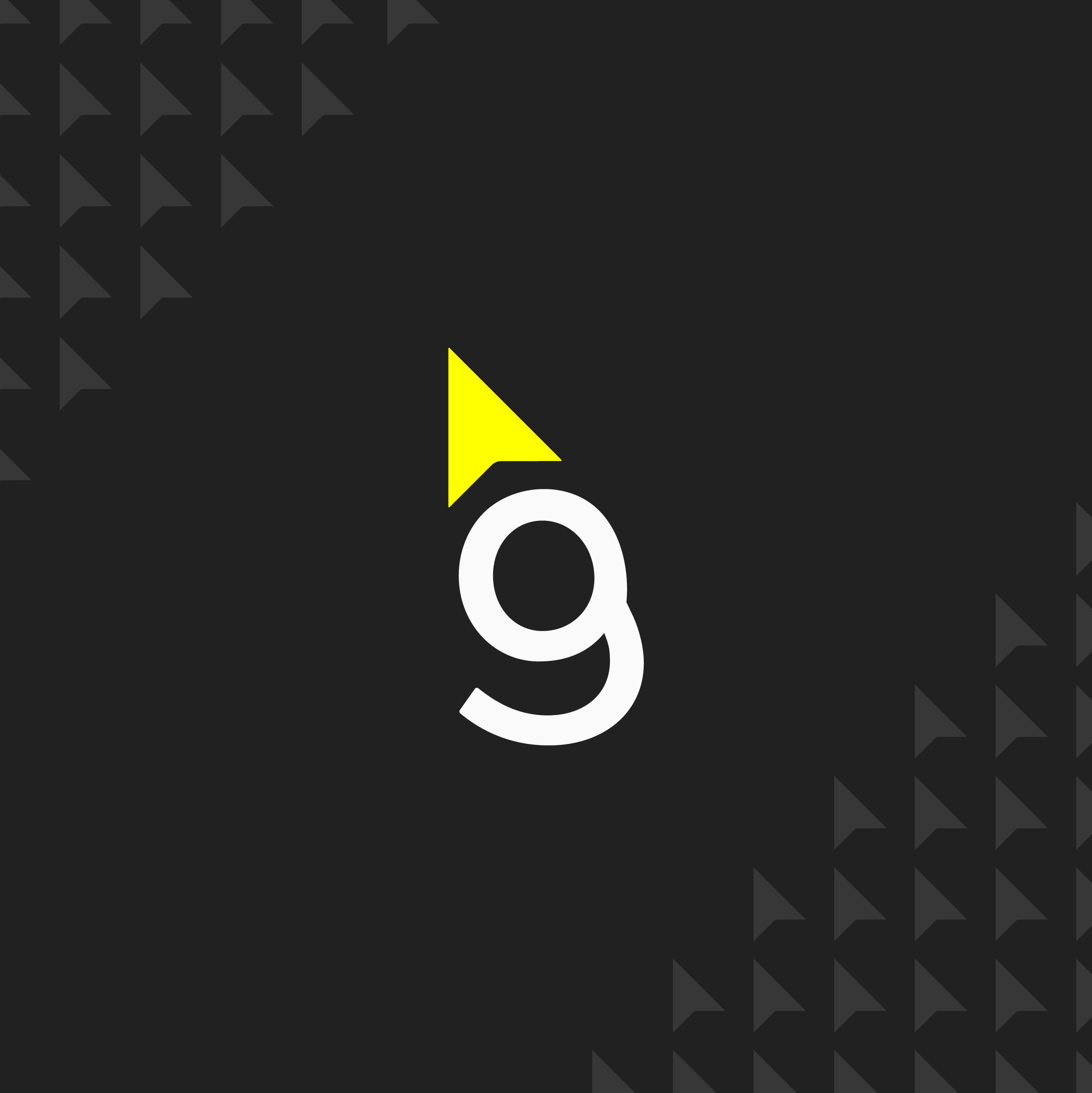

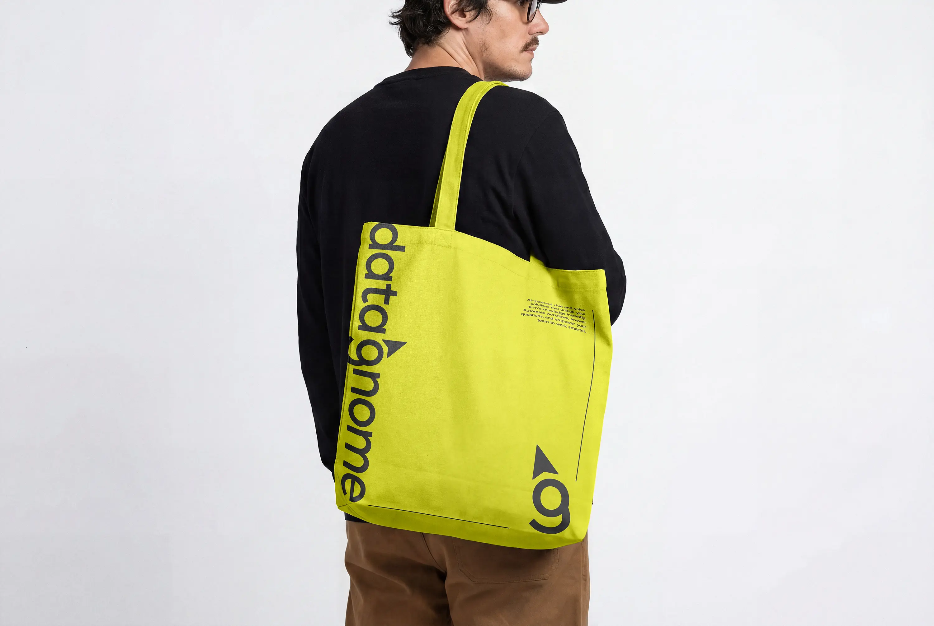
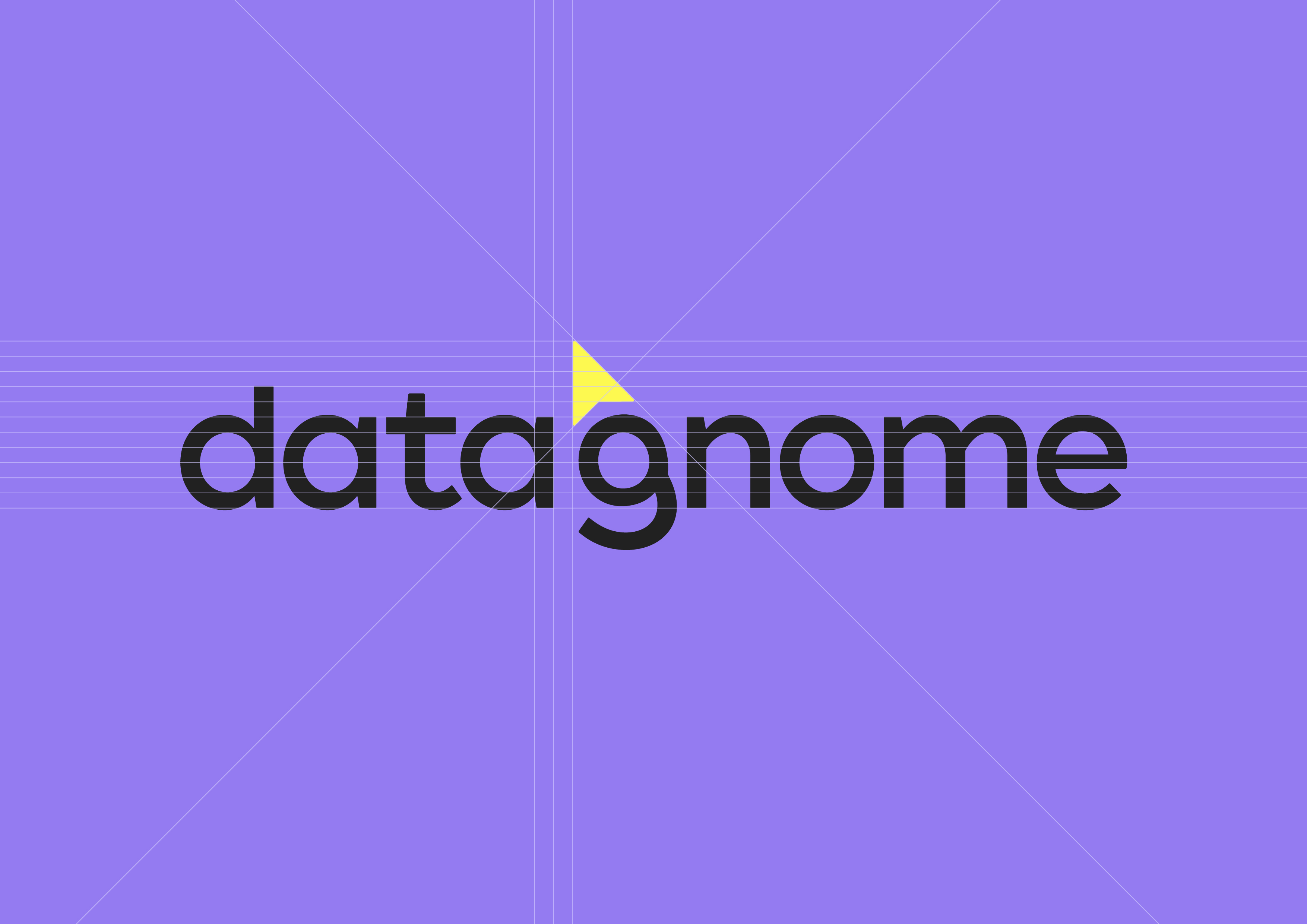
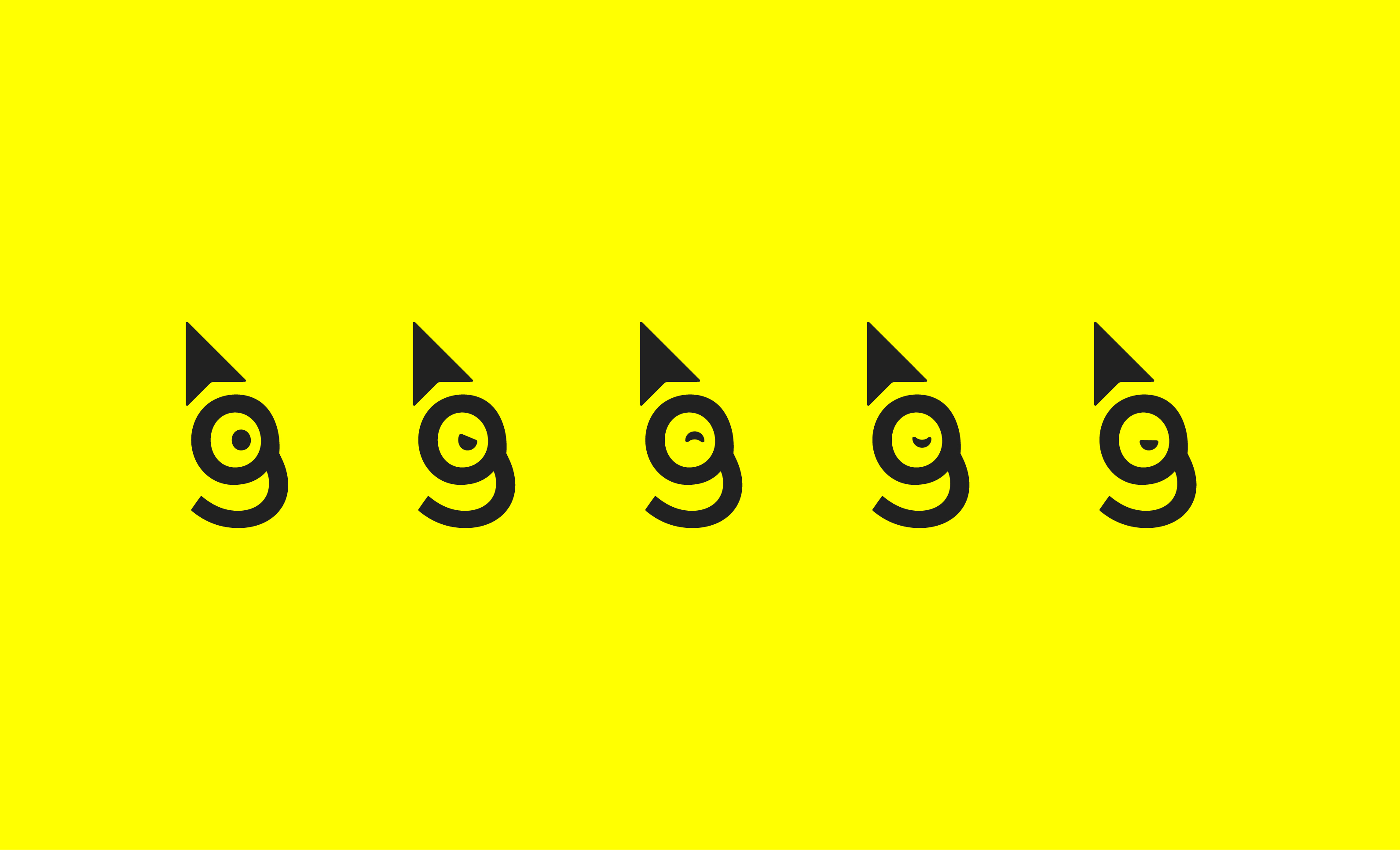
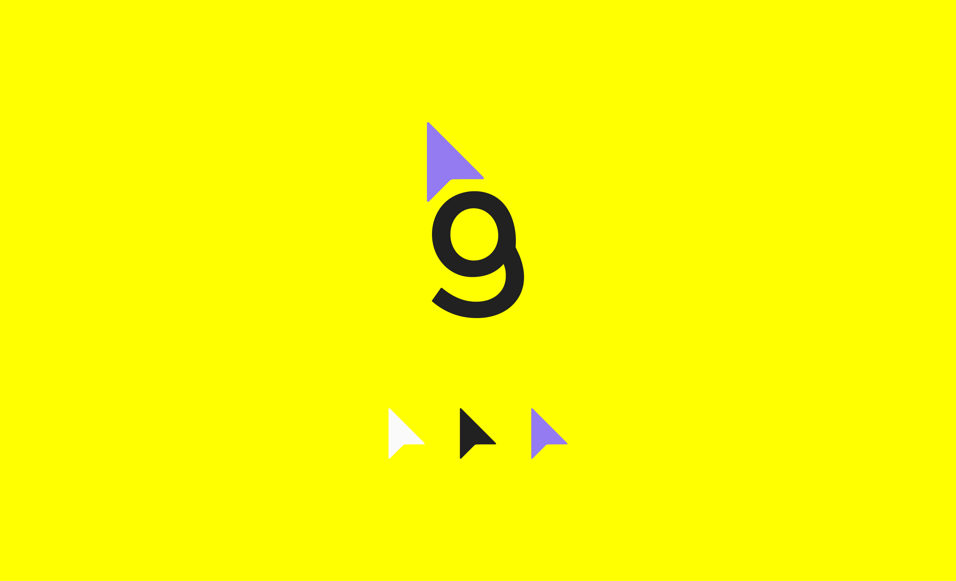
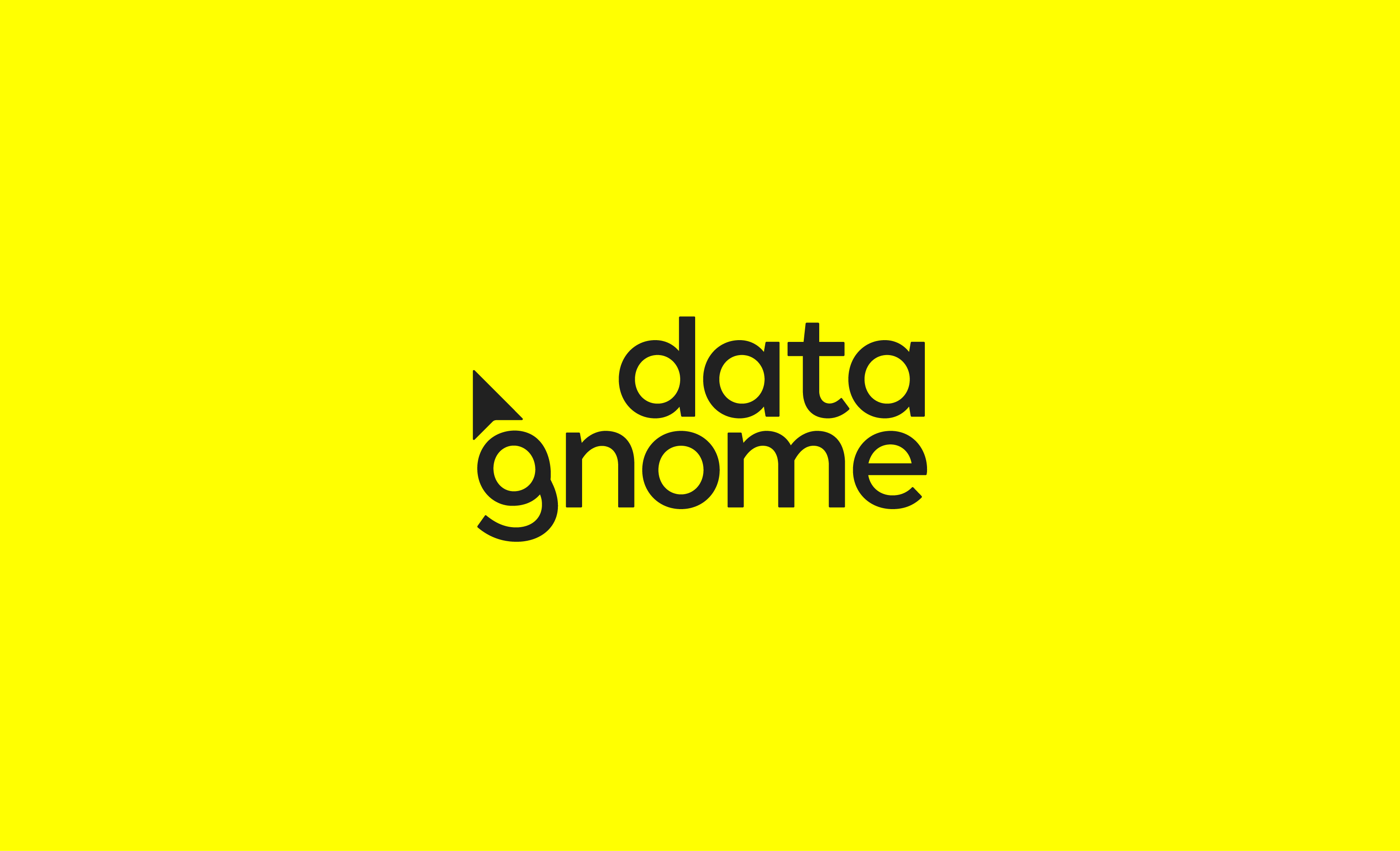
Because data retrieval sits at the heart of the platform, we leaned into the metaphor. Like a gnome mining for treasure, on request Data Gnome unearths the right information from inside colossal data sets, delivering it quickly to the user. We created an abstract gnome character built from a custom "g" letterform, its curves forming the face and beard, with a cursor as the gnome's hat.
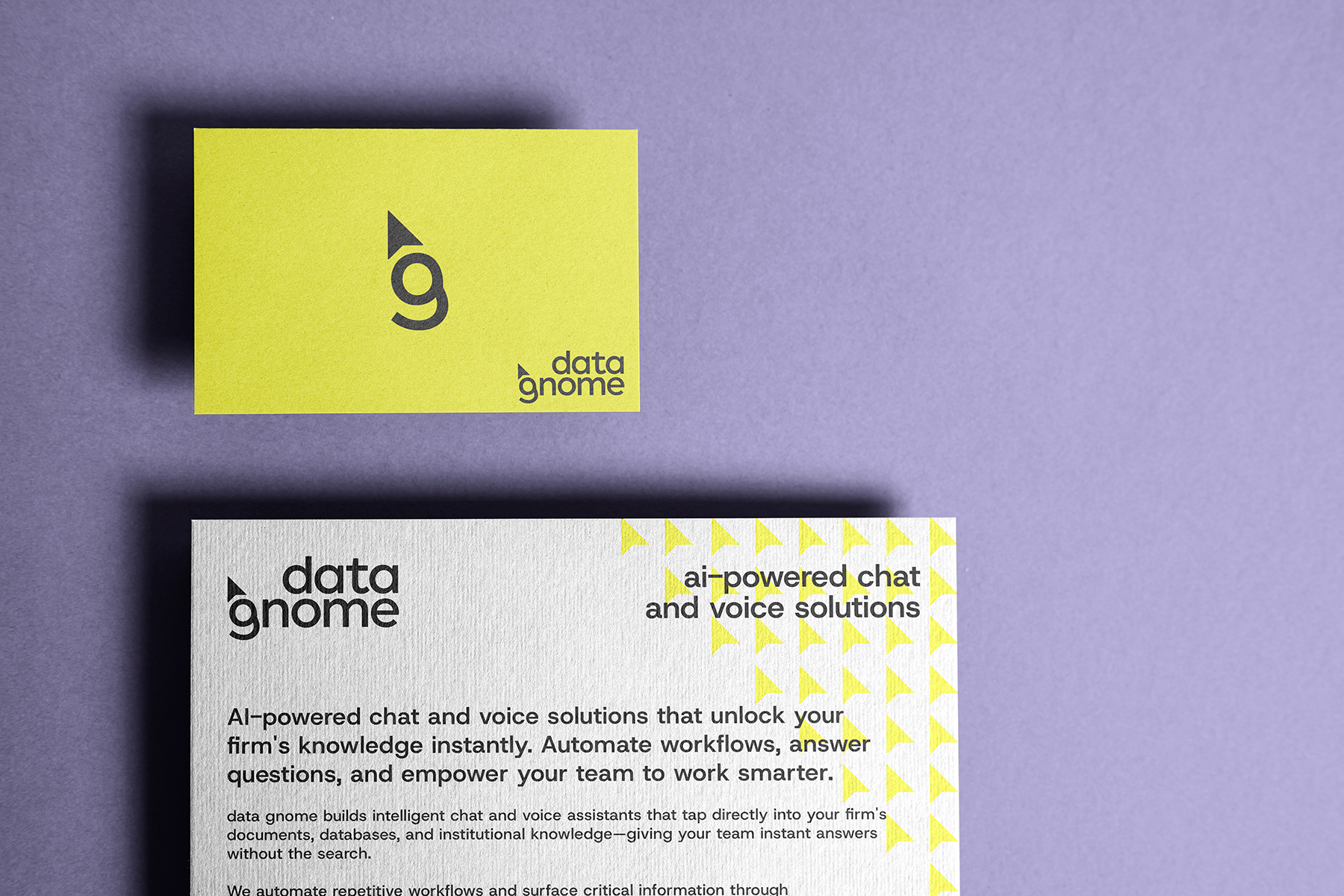
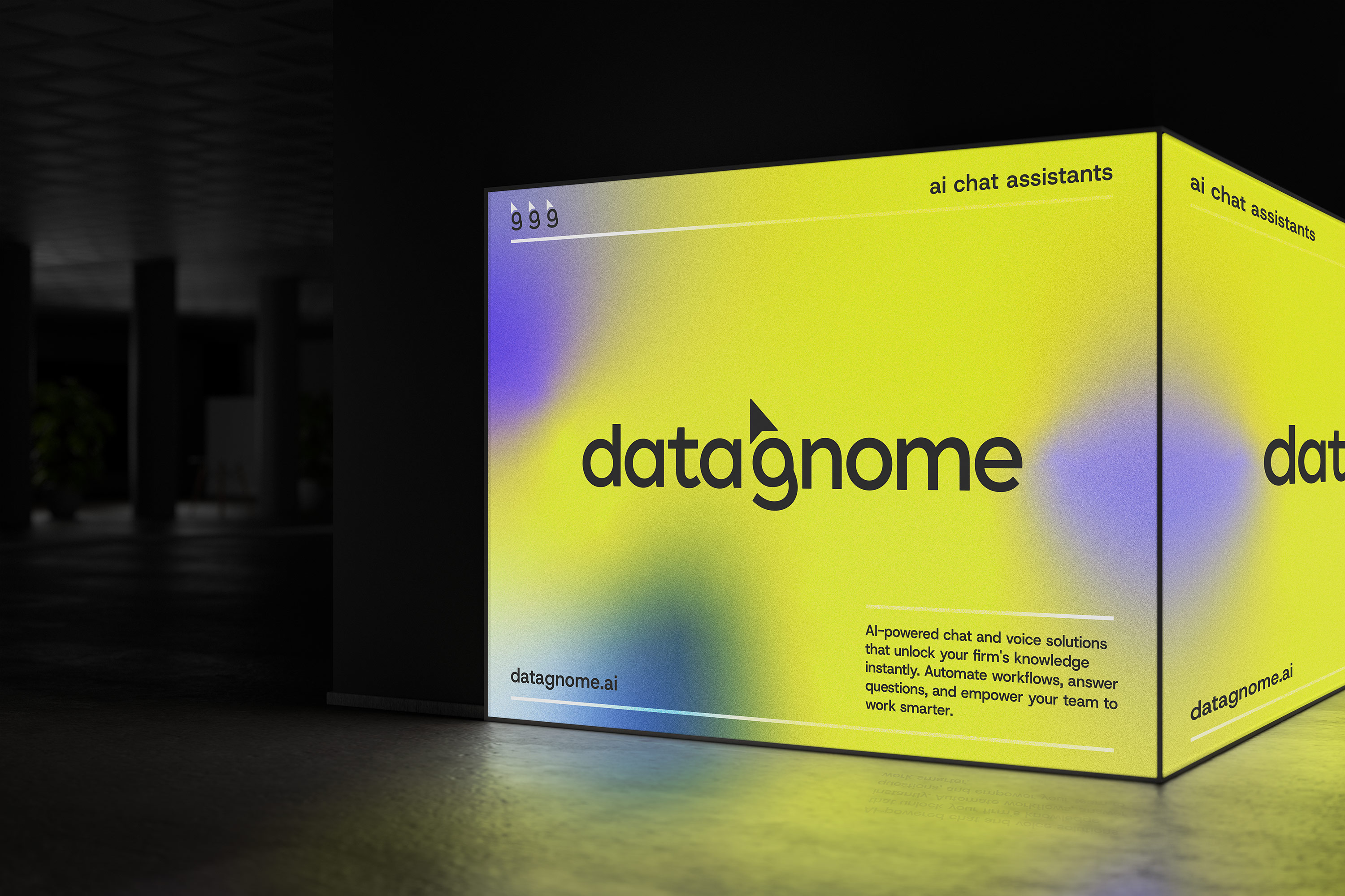
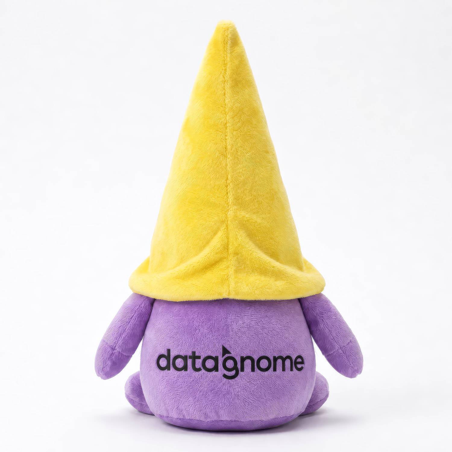
To set them apart from the sea of purple and blue SaaS competitors, we paired the mark with a bold, distinctive yellow centric color palette. From there, we built out a full brand system; typography, gradients, supporting graphics, and use-case guidelines, giving Data Gnome a confident, cohesive identity ready to scale alongside the business.



.webp)